Featured Posts

(Mis)-using itemRendererFunction and memory leaks One of the APIs that was added in Flex 4 to the new Spark List components was itemRendererFunction. It is really useful if you want to display different item renderers for different types of data. If...

Read more

Working with Touch in Flex At Adobe MAX, this year, I spoke at the 360|MAX conference about touch events in Flex. Some of the topics I talked about are:   Touch events and MultiTouch.inputMode in Flash Flex touch basics Why...

Read more

Adobe MAX 2010: Performance Tips and Tricks for Flex... Last year at Adobe MAX, I presented a talk on performance with Flash and Flex. I covered a lot of different tips and information that is useful for Flash and Flex developers. Check out the video on AdobeTV.

Read more

Intro to Spark Containers Here's a talk I did at work around Spark Containers. Some of the topics covered are: Types of Spark Containers Types of IVisualElements Group Basics The multi-faces of DOM Lesser known container...

Read more

Binding Dependencies A common problem I've run into, even on the SDK team, was when you have one property dependent on another property (or a set of other properties), and you need that property to be Bindable. For example,...

Read more

  • Prev
  • Next

(Mis)-using itemRendererFunction and memory leaks

3

Category : DataGroup, Flex, List

One of the APIs that was added in Flex 4 to the new Spark List components was itemRendererFunction. It is really useful if you want to display different item renderers for different types of data.

If you use itemRendererFunction a lot, you might have noticed that virtualization doesn’t quite work as you’d expect. Only the on-screen item renderers are created, but item renderers aren’t re-used. That is until 4.6 when SDK-27727 was fixed.

However, as was soon found out when trying to use it, this can actually cause issues. Let’s look at a typical example of how to use itemRendererFunction:

<?xml version="1.0" encoding="utf-8"?>
<s:Application xmlns:fx="http://ns.adobe.com/mxml/2009" 
               xmlns:s="library://ns.adobe.com/flex/spark" 
               xmlns:mx="library://ns.adobe.com/flex/mx">
    <fx:Script>
        <![CDATA[
            import mx.collections.ArrayList;
            import mx.collections.IList;
 
            [Bindable("__NoChangeEvent__")]
            private var myNumbersDataProvider:IList = new ArrayList(
                    [0,1,2,3,4,5,6,7,8,9,10,11,12,13,14,15,16,17,18,19,20,21,22,23,24,25,26,27,28,29]
                );
 
            private function myItemRendererFunction(item:Object):IFactory
            {
                var value:int = (item as int);
                var isEven:Boolean = (value % 2 == 0);
 
                if (isEven)
                {
                    return new ClassFactory(EvenItemRenderer);
                }
                else
                {
                    return new ClassFactory(OddItemRenderer);
                }
            }
        ]]>
    </fx:Script>
 
    <s:Scroller width="200" height="200" >
        <s:DataGroup dataProvider="{myNumbersDataProvider}"
                     itemRendererFunction="myItemRendererFunction">
            <s:layout>
                <s:VerticalLayout useVirtualLayout="true" horizontalAlign="contentJustify" gap="0" />
            </s:layout>
        </s:DataGroup>
    </s:Scroller>
</s:Application>

So what’s wrong with that? Well, if you run it in 4.5 or below, nothing really. The item renderers won’t be re-used, but everything works. However, if you run it in 4.6, you’ll notice that not only do your item renderers still not get re-used, but you’ve in-fact created a memory leak. As the user scrolls around, new item renderers get created, and all the old item renderers get stuck in memory.

In Flex 4.6, DataGroup was patched to recycle item renderers with an itemRendererFunction. However, it can’t just recycle all item renderers together because they are different (that is the point of the itemRendererFunction after all). So in order to figure out what item renderers can be recycled, it is based on what IFactory gets returned from your itemRendererFunction. To do that, it keeps a map of renderers to IFactories and a list of free item renderers by IFactory.

However, in this case, everytime it asks what IFactory to use to display a particular item, it gets back a new instance. In addition to this, DataGroup thinks it can re-use all the old item renderers, so they stay in-memory and hidden on the display list.

So how should you write your itemRendererFunctions? Well, rather than return a new instance of a ClassFactory everytime, you should return the same instance when possible. For the example above:

<?xml version="1.0" encoding="utf-8"?>
<s:Application xmlns:fx="http://ns.adobe.com/mxml/2009" 
               xmlns:s="library://ns.adobe.com/flex/spark" 
               xmlns:mx="library://ns.adobe.com/flex/mx">
    <fx:Script>
        <![CDATA[
            import mx.collections.ArrayList;
            import mx.collections.IList;
 
            [Bindable("__NoChangeEvent__")]
            private var myNumbersDataProvider:IList = new ArrayList(
                    [0,1,2,3,4,5,6,7,8,9,10,11,12,13,14,15,16,17,18,19,20,21,22,23,24,25,26,27,28,29]
                );
 
            private var evenItemRenderer:IFactory = new ClassFactory(EvenItemRenderer);
            private var oddItemRenderer:IFactory = new ClassFactory(OddItemRenderer);
 
            private function myItemRendererFunction(item:Object):IFactory
            {
                var value:int = (item as int);
                var isEven:Boolean = (value % 2 == 0);
 
                if (isEven)
                {
                    return evenItemRenderer;
                }
                else
                {
                    return oddItemRenderer;
                }
            }
        ]]>
    </fx:Script>
 
    <s:Scroller width="200" height="200" >
        <s:DataGroup dataProvider="{myNumbersDataProvider}"
                     itemRendererFunction="myItemRendererFunction">
            <s:layout>
                <s:VerticalLayout useVirtualLayout="true" horizontalAlign="contentJustify" gap="0" />
            </s:layout>
        </s:DataGroup>
    </s:Scroller>
</s:Application>

Even if you haven’t upgraded to 4.6 and don’t see this issue yet, it’s still a good idea to write your itemRendererFunctions this way. Unfortunately, there will be many people who upgrade to 4.6 without reading this blogpost, and all of a sudden their applications will start leaking memory. While one could say they’ve written their item renderer function incorrectly, the truth is that most people probably write their item renderer functions this way. It’s not necessarily a bug in the SDK, but given that so many people will face this issue (and it “breaks” on upgrading to 4.6), I think it’s something that should be addressed in the SDK.

Long-term, I’d like to see DataGroup expose an item renderer creation/recycling delegate, something similar to 4.5’s contentLoader concept. This would let people have more control over item renderer recycling. In addition, it would let people share item renderers across different DataGroup instance. However, short-term, I think we need something else.

I thought about adding in code just to limit the number of item renderers that get stored, but the way I decided to fix it was just to keep track of the number of item renderers that get created per item renderer factory. If more than one itemRenderer gets created for a particular factory, then we attempt to re-use item renderers for that factory–otherwise we just throw it away. This solution specifically handles this issue, without much overhead, and without much extra code. However, even after this, if you write your itemRendererFunction poorly, your item renderers still won’t be re-used (but atleast there will be no memory leak :-).

Because the Adobe Flex SDK JIRA has been exported already, I’ll wait until the Apache Flex SDK JIRA is up and running before submitting it as a patch. However, you can see the issue and the patch in this Flash Builder project.

Working with Touch in Flex

5

Category : Flex, Scrolling, Touch Interactions

At Adobe MAX, this year, I spoke at the 360|MAX conference about touch events in Flex. Some of the topics I talked about are:
 

  • Touch events and MultiTouch.inputMode in Flash
  • Flex touch basics
  • Why touch is difficult
  • How Flex components coordinate to interpret and react to ambiguous touch interactions
  • How to write your own code to deal with touch interactions and coordinate with other components appropriately

 
As part of that, I showed off two examples:
 

  1. How to create a checkmark item renderer to distinguish between down and selected in a touch environment
  2. How to create an item renderer that responds to a swipe gesture and shows a delete button (similar to iPhone’s email application)

 
Please help yourselves to the PowerPoint presentation (PPT | PDF) and the Flash Builder project with both applications. You can also play around with the first application below, and let me know if you have any questions about this. More information around touch interactions can also be found on the Mobile List, Scroller and Touch Specification.

Adobe MAX 2010: Performance Tips and Tricks for Flex and Flash Development

Category : Flex, Performance

Last year at Adobe MAX, I presented a talk on performance with Flash and Flex. I covered a lot of different tips and information that is useful for Flash and Flex developers. Check out the video on AdobeTV.

Intro to Spark Containers

Category : Containers, Flex, Group, SkinnableContainer, Spark

Here’s a talk I did at work around Spark Containers. Some of the topics covered are:

  • Types of Spark Containers
  • Types of IVisualElements
  • Group Basics
  • The multi-faces of DOM
  • Lesser known container features
  • Internals of Group and SkinnableContainer
  • Performance considerations

Binding Dependencies

4

Category : binding, binding dependency, Flex, parsley, presentation model

A common problem I’ve run into, even on the SDK team, was when you have one property dependent on another property (or a set of other properties), and you need that property to be Bindable. For example, in spark.components.VideoPlayer, volume is dependent on the videoDisplay.volume property. Usually to make such a property bindable, you add an event listener to know when your dependent property changes. In this case, if you check out VideoPlayer.partAdded(), you can see code like that. However, when I started using the presentation model pattern, this issue seemed to keep coming up quite frequently.

Let’s take a simple example where someone is placing an order. If that person has a billing address and a shipping address in California, we need to show them some extra questions because of extra regulations in California.

Our made up model looks like:

public class Order { 
 
    [Bindable]
    public var billingState:String;
 
    [Bindable]
    public var shippingState:String;
 
}

And in the View, we want to do something like:

<s:Form>
    <s:FormItem label="Billing State">
        <s:DropDownList selectedItem="@{ presentationModel.order.billingState }">
            <s:ArrayList>
                <fx:String>AL</fx:String>
                <fx:String>AS</fx:String>
                <fx:String>AZ</fx:String>
                <fx:String>AR</fx:String>
                <fx:String>CA</fx:String>
                <fx:String>CO</fx:String>
                <fx:String>CT</fx:String>
                <fx:String>DE</fx:String>
            </s:ArrayList>
        </s:DropDownList>
    </s:FormItem>
 
    <s:FormItem label="Shipping State">
        <s:DropDownList selectedItem="@{ presentationModel.order.shippingState }">
            <s:ArrayList>
                <fx:String>AL</fx:String>
                <fx:String>AS</fx:String>
                <fx:String>AZ</fx:String>
                <fx:String>AR</fx:String>
                <fx:String>CA</fx:String>
                <fx:String>CO</fx:String>
                <fx:String>CT</fx:String>
                <fx:String>DE</fx:String>
            </s:ArrayList>
        </s:DropDownList>
    </s:FormItem>
 
    <s:FormItem label="California Question1"
                includeInLayout="{ presentationModel.order.shippingState == 'CA' &amp;&amp; presentationModel.order.billingState == 'CA' }"
                visible="{ presentationModel.order.shippingState == 'CA' &amp;&amp; presentationModel.order.billingState == 'CA' }">
        <s:TextInput />
    </s:FormItem>
 
    <s:FormItem label="California Question2"
                includeInLayout="{ presentationModel.order.shippingState == 'CA' &amp;&amp; presentationModel.order.billingState == 'CA' }"
                visible="{ presentationModel.order.shippingState == 'CA' &amp;&amp; presentationModel.order.billingState == 'CA' }">
        <s:TextInput />
    </s:FormItem>
</s:Form>

Now the same code: presentationModel.order.shippingState == ‘CA’ &amp;&amp; presentationModel.order.billingState == ‘CA’ is repeated 4 times, the ampersands have to be escaped, and overall it’s just quite ugly. Now, one of the neat tricks I’ve learned is that you can spruce it up by doing something like:

<fx:Declarations>
    <fx:Boolean id="showCaliforniaQuestions"> {presentationModel.order.shippingState == "CA" &amp;&amp; presentationModel.order.billingState == "CA"} </fx:Boolean>
</fx:Declarations>
 
...
 
<s:FormItem label="California Question1" includeInLayout="{ showCaliforniaQuestions }" visible="{ showCaliforniaQuestions }">
    <s:TextInput /> 
</s:FormItem>
<s:FormItem label="California Question2" includeInLayout="{ showCaliforniaQuestions }" visible="{ showCaliforniaQuestions }">
    <s:TextInput /> 
</s:FormItem>

That definitely works and is much cleaner than before; however, that means we have some business logic in our View that is extremely hard to test. That logic should really be in the presentation model. If we try to move it into the Presentation Model, we’ll end up with something that looks like:

<s:FormItem label="California Question1" 
    includeInLayout="{ presentationModel.showCaliforniaQuestions }" 
    visible="{ presentationModel.showCaliforniaQuestions }">
    <s:TextInput /> 
</s:FormItem> 
<s:FormItem label="California Question2" 
    includeInLayout="{ presentationModel.showCaliforniaQuestions }" 
    visible="{ presentationModel.showCaliforniaQuestions }">
    <s:TextInput />
</s:FormItem>
public class MyPM {
    public function MyPM() {
        super();
    }
 
    [Bindable]
    public var order:Order = new Order();
 
    public function get showCaliforniaQuestions():Boolean 
    {
        return order.shippingState == "CA" && order.billingState == "CA";
    }
}

However, doing that doesn’t work. The reason is because showCaliforniaQuestions isn’t Bindable. Now, to make it Bindable, we need to add Bindable metadata on top, add event listeners (or use a ChangeWatcher) to let us know when the shipping state or the billing state changes, and dispatch a new binding event when we get notified that the shipping or billing state changes. This turns out to be quite a lot of extra, ugly code, which means most people just end up keeping this logic in the View because practically it’s just too much work and too ugly to move it to the Presentation Model. This is all fine, but this kept issue kept cropping up in practice, so I finally sat down to come up with a more palatable option.

One of the very cool things about Parsley is that you can add your own custom Metadata, and Parsley will help process it for you. Even though I’m really new to Parsley, it turns out that this is relatively easy to do. So I decided to go ahead and add some custom metadata to help deal with this. What’s really neat is that I added a Parsley processor for Bindable metadata. I added a new property on that metadata, which allows you to define binding dependencies–basically Bindings that are dependent on other properties. In our particular example, here’s what it looks like:

[Bindable(event="showCaliforniaQuestionsChanged",dependentProperty="order.shippingState")]
[Bindable(event="showCaliforniaQuestionsChanged",dependentProperty="order.billingState")]
public function get showCaliforniaQuestions():Boolean
{
    return order.shippingState == "CA" && order.billingState == "CA";
}

All we did was declare the showCaliforniaQuestions as Bindable, where that binding is dependent on the order.shippingState and order.billingState properties. The Parsley metadata processor will step in and handle everything else. I personally like this solution a lot as it piggy-backs off of the Flex SDK framework’s Bindable metadata and just extends it for our purpose. It’s easy to use and pushes our logic into Presentation Model, which makes our code cleaner and more importantly, testable.

The main downside to this approach is that we’re exposed to spelling mistakes or later refactorings since the dependentProperty in the Bindable metadata is not checked by the compiler. Ideally, this would be something we could add to the ActionScript compiler so that it could inspect the getter and pick out all the bindable variables. However, we don’t have that, and I find this pattern really convinient for me. The code for all of this can be found in the attached Flash Builder project — feel free to use it.

Why Presentation Models can be confusing

7

Category : Flex, presentation model

When I decided to leave Adobe and the Flex SDK team after almost 4 years, I left because I wanted to see what issues people were encountering with the SDK and to learn what some of the challenges are with application development. Well, one of the first things you’re bound to encounter as an application developer working on a large application is some way to separate the logic of the View from the actual look of the View (as well as the actual business logic, but I won’t talk about that here). There are lots of ways to achieve this separation, and I’m not going to debate which way is best to it However, I’m going to take a look at the Presentation Model pattern and go through some of the questions I had when I was trying to understand this pattern. Luckily for me, I have a lot of great co-workers, like Miguel Sanchez and Dan Johnson who helped me understand it.

Introduction:

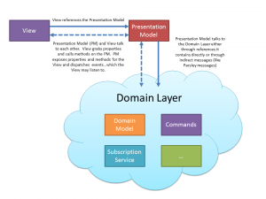
The Presentation Model is a standard pattern where logic to control the state and behavior of the view is extracted from the view itself. Simply, the Presentation Model (PM) controls what the View displays–the View controls how to display that information. The PM coordinates with the domain layer to retrieve information and perform actions.

Goals:

The purpose of the Presentation Model pattern is to:

  • Separate out the state and behavior of the view from the presentation of the View itself
  • Provide a GUI agnostic, testable interface
  • Provide a consisten, performant pattern that developers can easily follow

Definitions:

View – A class defining the GUI for a particular part of the application. The View may be composed of other Views or other UI controls
Presentation Model (PM) – An abstraction of a particular View. It controls the state and logic for a particular View; however, it does not control how the View presents this information.
Domain Layer – A generic term for the business logic for a particular application. This may include domain models, commands, service layers, controllers, etc…

Overview:

Presentation Model Pattern Diagram

View Responsibilities:

  • The View should contain very little logic–only GUI specific, layout implementation should be contained in the View
  • The View should use databinding to grab information from the Presentatio Model
  • The View should call methods directly into the PM (see FAQ for description of right level of abstraction)
  • The View should attach Flash event listeners on the PM to receive any event information (if using Parsley, the View should not communicate to anyone using Parsley messaging as configuring a display object in Parsley is a huge performance hit)

Presentation Model Responsibilities:

  • The PM should hold the logic, state, and data of the user interface. It is essentially an abstract, non-GUI dependent abstraction of a View
  • The PM controls what the View displays (how to display it is up to the View)
  • The View calls into the PM via public methods. The PM then takes those actions and talks to the Domain Layer.
  • For the PM to talk to the View, it should use properties with data-binding or Flash events.

FAQ (aka-Questions I had)

If the Presentation Model is tied 1:1 to a View, why create another class, when the View can contain that logic directly? The main purpose of the PM is to separate out what the View should display from how it should be displayed. The PM controls the state, behavior, and any business logic for the View. The View controls how to display the appropriate information. The point of the PM is not to be reusable in other Views. In order to foster code re-usability, put similar code into the Domain Layer or into the other PMs that can be used by your PM. As Martin Fowler says, “Presentation Model may interact with several domain objects, but Presentation Model is not a GUI friendly facade to a specific domain object. Instead, it is easier to consider Presentation Model as an abstract of the view that is not dependent on a specific GUI framework.”

What is the right level of abstraction for the View and the PM to talk to each other? Here are some examples of how the View may talk to the PM:

  1. <s:Button id=”submitButton” click=”{ myPM.submitButton_clickHandler }” />
  2. <s:Button id=”submitButton” click=”myPM.onSubmitButton(busIdTI.text)” />
  3. <s:Button id=”submitButton” click=”myPM.setBusId(parseInt(busIdTI.text))” />
  4. <s:Button id=”submitButton” click=”myPM.unsubscribe(); myPM.setCurrentBus(new Bus(parseInt(busIdTI.text))); myPM.subscribe();” />

There is no right or wrong answer here, but in general, the approach should probably be #2, #3, or somewhere in between. Try to stay away from #4 where the View does too much work. Try to stay away from #1 where the PM now knows about the GUI concepts (a MouseEvent in this case).

If your View is displaying data in a grid, where should the column definitions for that grid go? The Presentation Model defines what the View display; however, the goal should be to do that in a GUI agnostic approach. Ideally, the PM should define what columns need to be displayed as Strings or Enums, but it wouldn’t actually define DataGridColumn instances. In a practical world, this ideal separation doesn’t always make sense and can introduce a lot of unnecessary “translation code” (code whose sole purpose is to take the abstract output from the PM and concert it into a GUI specific implementation); however, in almost all cases, that goal should be striven for as it makes the Presentation Model more testable.

What is the difference between a “View” and an ordinary UI control? A View is a UI control, but it is a special UI control that represents an abstract interface for your particular application. A View may contain other Views and other UI controls. In general, not all custom components or views need to have a Presentation Model, but if the view has a reasonable amount of state and behavior, then the code should be split up into a View and a separate, testable Presentation Model. In general, it’s up to the developer to make this judgement call, but a lot can be said for the consistency of always having a Presentation Model, even if it doesn’t do much.

Can a Presentation Model contain other Presentation Models? In general it can. There are two basic models for this (atleast that I know of–see http://blogs.adobe.com/tomsugden/2009/08/applying_the_presentation_mode.html). In the Componentized Presentation Model, the View can contain other sub-Views. Those sub-Views have references to their own PM, but the main View’s PM does not have direct references to the sub-Views’ PM. In the Hierarchal Presentation Model pattern, the main PM contains references to the other PMs directly.

How does the Presentation Model get attached to the View? In Parsley, the top-level view creates a Parsley context. This parsley context instantiates the Presentation Model needed for that View. The View has a FastInject tag to grab the Presentation Model. When using the Componentized Presentation Model (Views contain other sub-Views that need their own Presentation Model), the Parsley context also defines the sub-View PMs (either as a single instance if only one sub-View will be created or as a DynamicObject if multiple sub-Views are needed). To communicate with other Presentation Models, use Parsley messages. In the Hierarchical Presentation Model, the main Presentation Model would instantiate the sub-View presentation models directly and can be used to communicate with the sub-Views directly.

Conclusion:

It took me a while to understand why the Presentation Model pattern would be useful. In my first attempts at it, I kept making the “Presentation Model” more of a wrapper for a Domain Model object–something that could be re-used in multiple Views. Though having an object like that is useful–that is not the Presentation Model. The Presentation Model is there to help separate out the look of the View from the state and behavior of the View.

In a lot of ways, this separation reminds me a lot of a SkinnableComponent vs. a Skin. However, there’s a more explicit contract in Flex 4 around SkinnableComponents and Skins; there are a set number of supported and toolable ways that the SkinnableComponent and the Skin can talk to each other. Having a tight contract like that and tooling support can be really useful, and it might be useful for the Presentation Model pattern as well. However, more on that and other issues I’ve encountered at a later date. I’m still relatively new to Presentations Models, so comments are much appreciated.

References:

When to use what Spark Container

6

Category : Containers, Flex, Group, SkinnableContainer

As always, I’m disappointed with the amount I blog. One strategy I’m going to take is to take questions asked on forums that I think are interesting and provide an answer. So, for this first question comes from a forum post.

Question: We know that Flex 4 has all these new Spark containers, like Group, VGroup, HGroup, etc…as well as the old MX componentas as the Canvas, Panel, VBox, HBox, etc…

This gets me really confused on which container I should use with my project.

For example, what’s the difference between:

<s:Group>
    <s:layout>
        <s:HorizontalLayout />
    </s:layout>
</s:Group>

…and…

<s:HGroup>
</s:HGroup>

…or even…

<mx:HBox>
</mx:HBox>

I’m sorry if I’m saying something wrong but it makes me waste so much time thinking on which one i should use cause, for me, all of them do exactly the same.

One other thing is if I need to do a container with a background color. What should I use?

<mx:Canvas backgroundcolor="{color}">
    <MyComponents />  
  </mx:Canvas>

…or…

<s:Group>
    <s:Rect>
        <s:fill>
            <s:SolidColor color="{color}" />
        </s:fill>
    </s:Rect>
    <MyComponents />
</s:Group>

Can anyone tell me which one is the best pratice now for Flex 4?

Answer:

We hope you can use the new Spark components whenever possible. Group is the basic, chromeless container. SkinnableContainer is our basic container with chrome (for instance Panel extends SkinnableContainer). One of the cool new things you can do in spark is swap layouts. For instance, you can use a HorizontalLayout with a Group, or you can even create a custom layout and use it with your List. This is really powerful, and this separation between a container and the layout make a lot of things easier, That said, for really common use-cases, we found some people were annoyed with having to type:

<s:Group>
    <s:layout>
        <s:VerticalLayout horizontAlign=".." />
    </s:layout>
     ...
</s:Group>

And people were used to having HBox and VBox. Because of this, we created helper classes, HGroup and VGroup, which extend Group and have the layout object baked in. They don’t really add any functionality…they are just there as a shortcut. To make it easier we also proxy up some layout-dependent properties on to the container, like horizontalAlign and verticalAlign.

In summary:

HBox, VBox, and Canvas are replaced by one component, Group. However their functionality is really replaced by HorizontalLayout, VerticalLayout, and BasicLayout, respectively. We have helper objects HGroup and VGroup to make common tasks easier. If you want a skinnable form of those components (something with chrome), use SkinnableContainer and change the layout (we did not provide helper classes HSkinnableContainer and VSkinnableContainer because we don’t think it’s as common of a use-case).

As a side note, I think you should always switch to using these new Spark container classes whenever possible. We think they are more flexible because of swappable layouts, and they also support GraphicElements directly, while MX containers do not. In addition, the Spark classes are made to be lighter-weight and more performant. For instance, they don’t have scrollbars built in, and they are chromeless. An exception is if you used Canvas and advanced constraints before. We haven’t created an AdvancedConstraint layout yet (they are in Flex 4.5, though).

As per the backgroundColor part of your question, you could composite it together like you did in the Group:

<s:Group>
    <s:Rect>
        <s:fill>
            <s:SolidColor color="{color}" />
        </s:fill>
    </s:Rect>
    <MyComponents />
</s:Group>

However, ideally, I’d tell you to use SkinnableContainer and place the Rect in the SkinnableContainer‘s skin. This way you’re segregating the content of the component from the look of the component. This is part of the “container with chrome (SkinnableContainer) vs. container with no chrome (Group)”. As we started out down the Spark architecture path, we really pushed hard for people to use this new skinning model, and in this case, we would push people to put the <s:Rect> in to the skin, but in balancing our “theoretical ideal of the skin vs. the component” and the usability of the framework, we received feedback that for common situations we need to provide styles. Because of this, our default SkinnableContainer skin already has a background rectangle in it, and you can control its color with the backgroundColor style, like:

<s:SkinnableContainer backgroundcolor="red">
    ...
</s:SkinnableContainer>

We baked this background and backgroundColor style in to the SkinnableContainer component for ease-of-use, so you don’t have to create a skin just for such a simple change. However, if you want something really complex (like a rounded rectangle as the background), then you should re-skin the SkinnableContainer.

Hope this helps answer a lot of questions.

-Ryan

BugQuash

Category : bugquash, Flex

There’s an awesome event going on tomorrow–BugQuash. The idea is simple: get together with a bunch of other Flex developers and work on fixing bugs in the SDK. I think this is good for two reasons. It’ll help fix a bunch of bugs, and it help create a better community around the SDK. I really, really wish I could attend tomorrow, but I can’t because of some other obligations. However, I’ll try to come back and be online for part of it towards the end, plus there’ll be some other Flex SDK engineers available during the bugquash. The event goes from Sat., March 28, 2009 10 am – 8 pm PST, and it’s definitely worth checking out.

Flex Videos on your iPod

Category : Flex, Flex Videos, swc

The “Flex in a Week” training videos are becoming more popular. Because of this, we’ve decided to make them available for your iPod. I think we’ll be publishing more, but for now some of our more popular ones are up there.

One of mine is up there–the one about building SWC files.

Here’s a link to the videos: iTunes | Adobe Developer Connection Videos

MAX 2008: Item Renderer Talk

1

Category : Flex, item renderers, MAX 2008

MAX has been a lot of fun so far this year. Joan and I gave a talk at MAX|360 on item renderers. It was a decent crowd for the 360 area, and we got a lot of questions, which was awesome.

I think the presentation went really well. There was only one goof in the code, and I’ve fixed that in this posting (the item renderer code was fine–I just forgot to set editable=”true” in the DataGrid for RatingExample4.mxml). We had to speed through in the end and didn’t get to talk too much about the star rating renderer or some of the gumbo stuff, but we did get to answer a lot of people’s questions, which is what’s important.

There’s a lot of good stuff in there, including how to implement IDropInListItemRenderer, using states in renderers, using a checkbox as an editor, and a “star rating renderer,” which I hope people can use.

Here’s the last example we didn’t get to show:

Anyways, take a look at the slides & examples, and let me know if you’ve got any questions.

Slides (PDF) | Slides (PPTX) | Code Examples